Johnston Underground font history:
Name of the typeface: Johnston ( or Johnston Sans)
Name of the typeface designer: Edward Johnston
Year it was designed: 1913
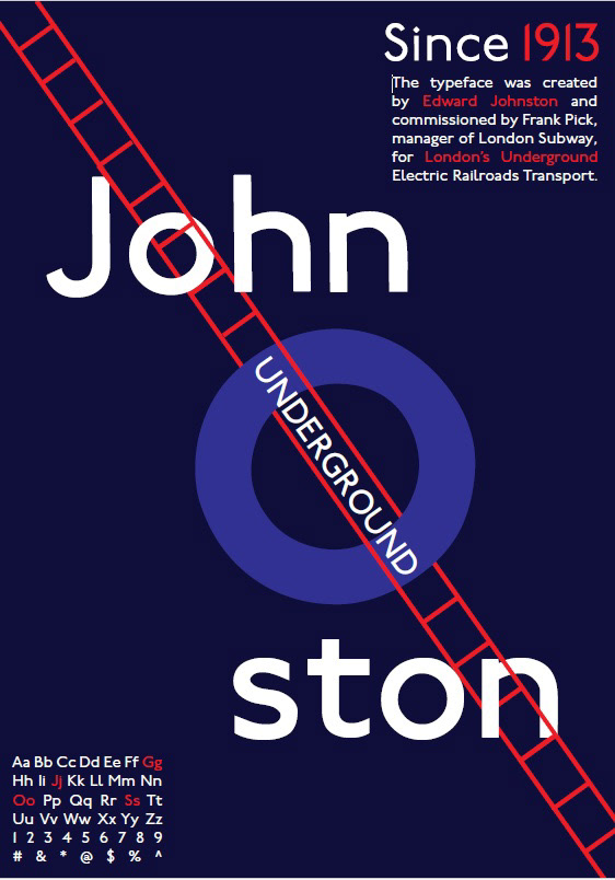
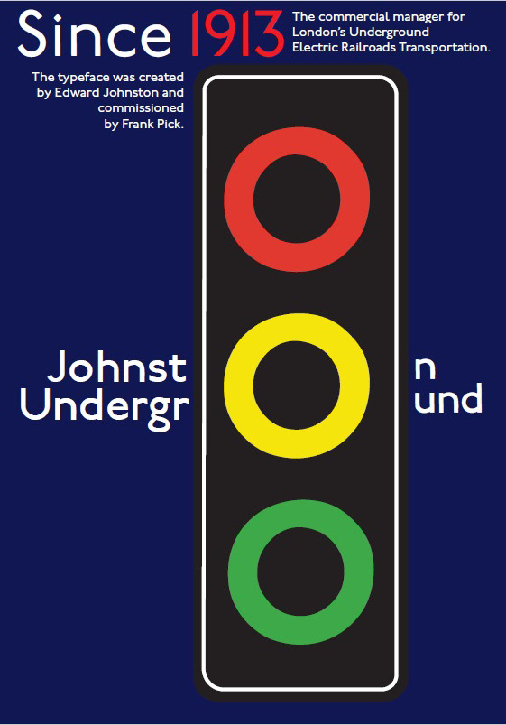
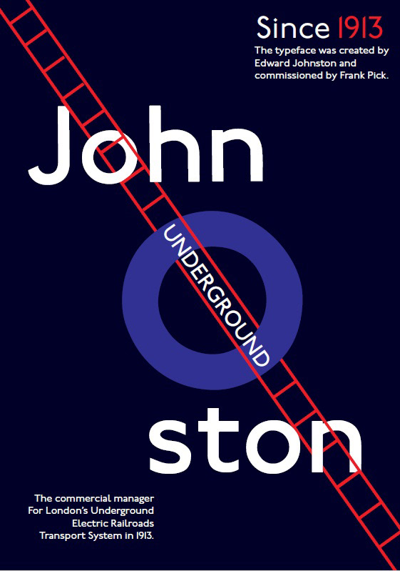
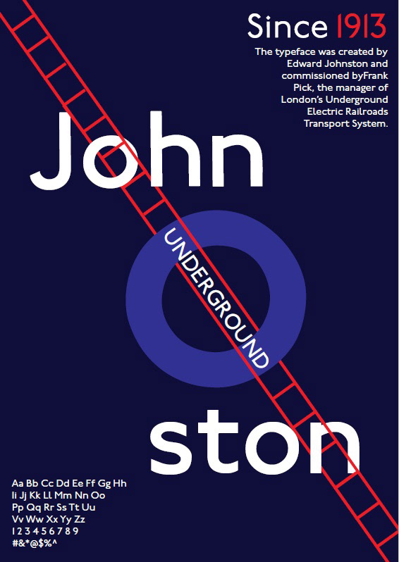
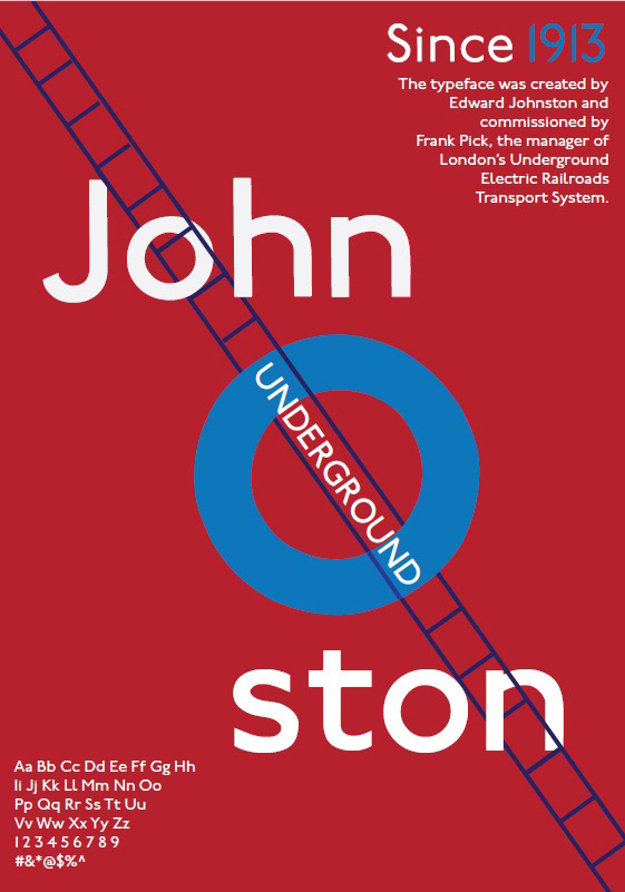
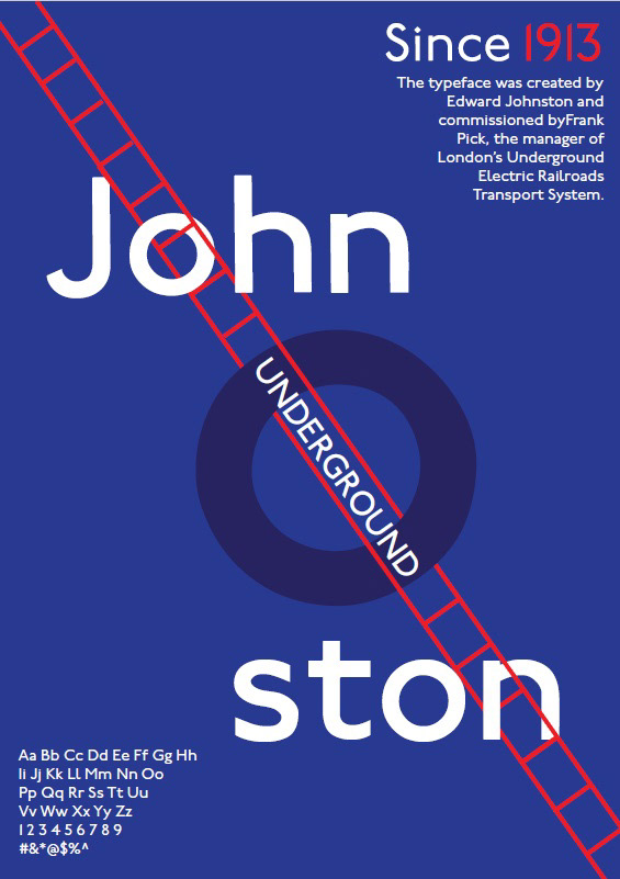
The typeface was created by Edward Johnston and commissioned by Frank Pick, the commercial manager of the Underground Electric Railways Company of London in 1913. It was created for London's underground electric railroad transport system.
Aa Bb Cc Dd Ee Ff Gg Hh Ii Jj Kk Ll Mm Nn Oo Pp Qq Rr Ss Tt Uu Vv Ww Xx Yy Zz
1 2 3 4 5 6 7 8 9
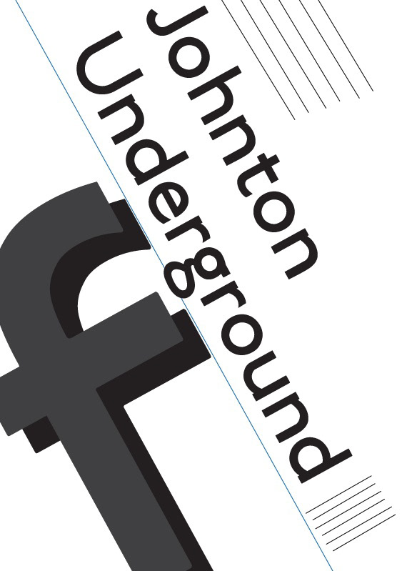
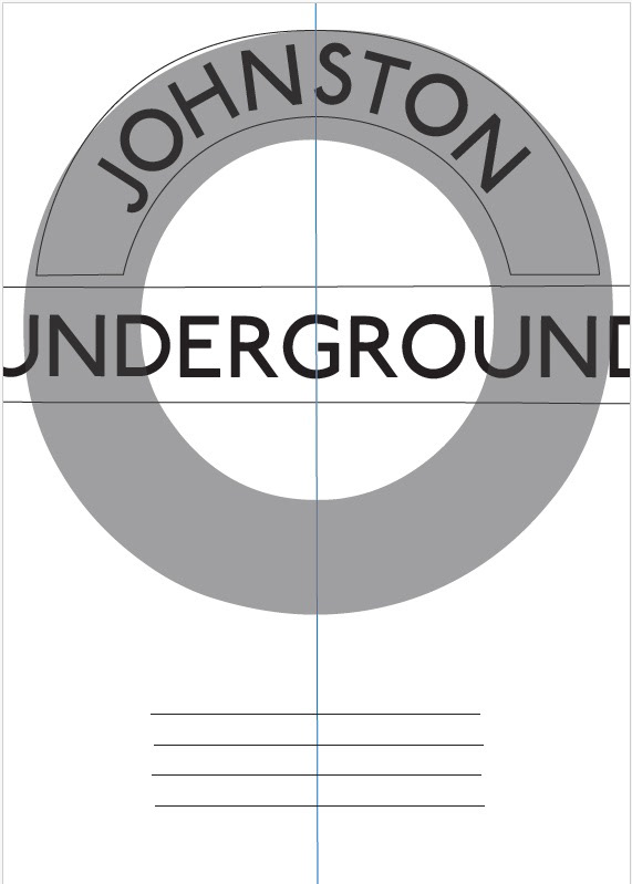
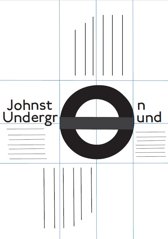
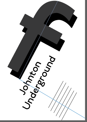
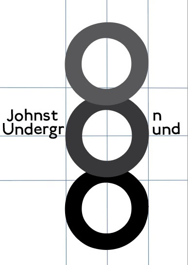
First rough drafts
Color and depth exploration:
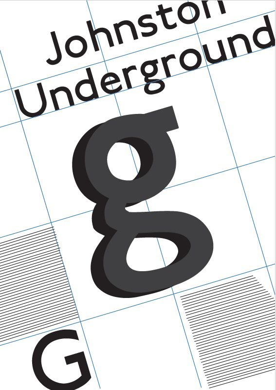
1- I decided to use the red, blue, and white standard colors for the "Johnsotn Underground" sign, which is similar to the European Union's stop sign (it's colored blue on the inside). I also decided to use all caps for the name of the font, because that's also what is used on the sign. I liked the letter "g" better in that font because of its rounded shapes, and I added depth to it with the other colors I had already used (black, white, red, and blue).
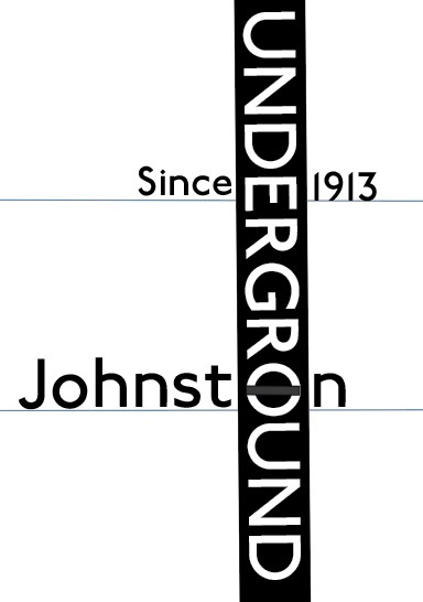
2- Is the same design as the first one but with different colors, this color scheme I got from another poster I saw for this same specimen type.
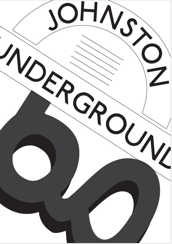
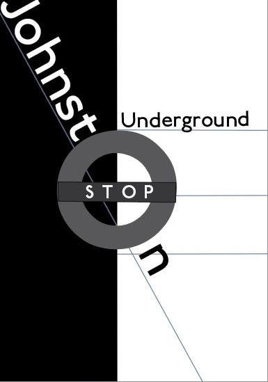
3- I decided to use the letter "O" of the font to do the rounded shapes and I've chosen the colors of a traffic light on top of a rectangular shape. The text in this design is split by the letter "o" which is part of the words.
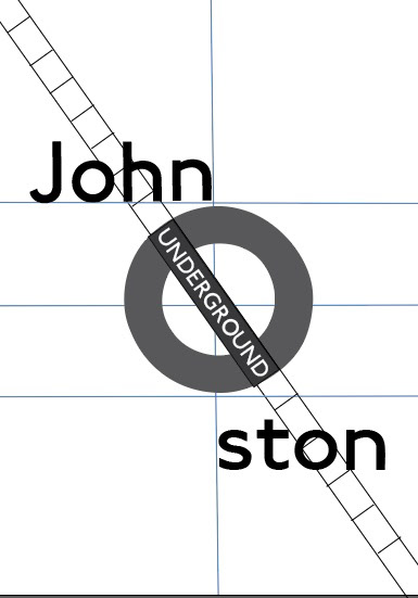
4- I used the letter "O" of the font to reference a stop sign. But this time, I decided to run a train trail through it, referencing the original purpose of this font (it was designed for London's underground electric railways). The depth here is between the train trails, the letters, and the circles that overlay each other.


Final Iterations

Final Poster